|
Equipment
|
|
Personal CritiqueSome thoughts on where I've been, as I contemplate where I'm going. Deep Carving with Fine Detail
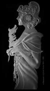
This series, started in December 2002, brought together some lessons learned from earlier Mucha work. The "coloring book" look is almost gone (see below), and the "bleeding" problem has disappeared. Contouring is improving (the arm looks better), but additional work remains in blasting the face (about 3/4 inch square on this version). Designs are improving, with more open space and shading to give the work a better appearance when not lit. I've decided I can't do Mucha's work literally; the glass carving has substantial restraints, but also a few additional tools that could be beneficially applied.
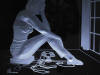
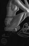
"Pensive Woman" SeriesThere's a more thorough critique of these pieces on the Texture page.
This is the second attempt in the series. The body contours are working, and the sweater top has shading that conforms to the three dimensional shape. Much work remains.
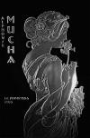
Early Mucha Pieces
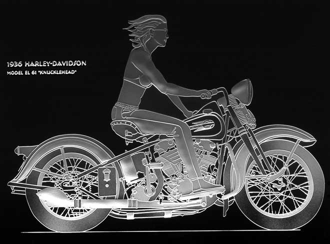
Probably the biggest "lessons learned" were a part of this effort. Much of Mucha's art is available without restriction from Dover Press, including the "Mucha Coloring Book" with simplified designs. My first attempt was to scan these images, and have Adobe Streamline convert them to vector format. This proved disastrous, with much more time spent on cleanup that it would have taken to draw/trace from scratch. I ended up redrawing the image in Illustrator. The piece has a lot of the "coloring book" look, with heavy outlines, and less dense "fill". I attempted some contoured fill on the arm, but the blasting strategy for the rest of the piece was incomplete. Classic Motorcycles
Classic Automobiles |
|
©2005 Graydog Services • webmaster: jim(at)graydog(dot)org |